🎥 Subscribe to Our YouTube Channel!
D365 Snippets
Data 365 Snippets
Home
Category
Power BI
Microsoft Excel
ERP Concepts
Dynamics 365 FO
Artificial Intelligence
Trending
Data Trends
BI Trends
About
Contact
DMCA
Disclaimer
2024
Implementing Row-Level Security (RLS) in Power BI
Power Bi Calendar Table in Less Than 10 Seconds
Power BI Sales Performance Dashboard Report
Download and Install Power BI Desktop
How to Convert Transaction Currency Amount to Company Ledger Currency in D365FO
Introduction to Power BI
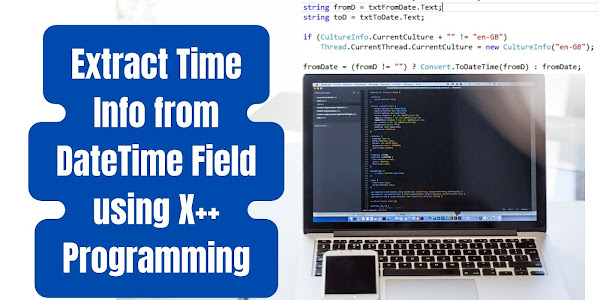
Extract Time Info from DateTime Field using X++ Programming
Joins in Dynamics 365 Finance and operation
How can you select the best ERP system for your startup?
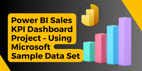
Power BI Sales KPI Dashboard Project – Using Microsoft Sample Data Set