Are you new to Power BI and you want to try it out, as a fresher getting a perfect dataset is little difficult, but here Microsoft provides a sample dataset which is already clean, and you can easily use to develop your power bi dashboard reports. The sample is dataset is embedded with Power BI desktop version.
1. Where Sample Dataset Located?
You can easily access the sample dataset by using the path.
Open Power BI desktop version and open the menu Help > Examples > Sample dataset.
2. Load Sample dataset
The first step of dashboard development is, we need to load the dataset to Power BI desktop, for this click on the sample dataset from the path shown above and click Load Samples Data button as shown below.
Our sample dataset contains two data sheets, tick financials sheet, then you can see the data loaded in the preview window, click the Load button. Since the data is already clean, we no need to clean the data again, so we can directly loan the data from dataset to the power desktop.
Once the data fully loaded, you can see one table which is created in the right side of the window under the Data Section as shown below.
3. Create a Date Table
Our sample dataset contains sales related data, so we need to add different search criteria like filter by date period, filter by customer name, filter by nationality etc… the recommended method for filtering with date period is use a date table and map this date table to required table where the data is stored by using the model view window.
For this, you need to open the model view which is located at the left side of the power bi desktop window, then make a one-to-many relation with date field of date table to the date table of the financial table as shown below.
4. Ad visuals
Once you have completed all the above basic steps, we need to add visuals to the power bi project, here we are adding mainly Card Visuals to show the summary data, Slicers for various filters, donut chart, Column Charts and different bar charts.
1. Slicer
A slicer is a visual filter used to filter the dashboard and display the information only we want. In our project we need to filter the dashboard reports by date, customer name, location, product etc.
For this open the report view tab from the left side and then add four slicer visuals from the visualization tab, these four slicers are used to filter the report with year , month , product and country, then right click on the year slicer and then drag and drop the year column of the date table to the field property of the year slicer , similarly right click on the month slicer and then drag and drop the “Month Name” column of the date table to the field property of the slicer Month as shown below.
For adding Product and Country, drag and drop the fields from financials table, now the slicer set up is ready,
In Visualization Tab, click on the format your visuals > General, the change the Title of the slicer as shown in the figure.
you can see the four slicers are allocated at the top of the dashboard report.
2. Add Card Visuals
In our project we use card visuals to display the summary of total sales, total costs, profit, and the total number of items sold.
For this add four card visuals from visualization tab,
- Right click on the first card visual and then drag and drop the “Sales” column of the date table to the field property of the slicer Month.
- Right click on the second card visual and then drag and drop the “COGS” column of the date table to the field property of the slicer Month.
- Right click on the third card visual and then drag and drop the “Profit” column of the date table to the field property of the slicer Month.
- Right click on the fourth card visual and then drag and drop the “Units Sold” column of the date table to the field property of the slicer Month.
In Visualization Tab, click on the format your visuals > General, then change the Title of the card visuals as shown in the figure.
you can see the four cards are allocated at the top of the dashboard report.
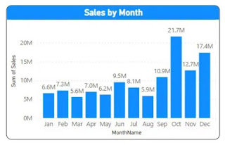
3. Clustered Column Chart
A clustered column chart is used to create a sale by month report, X – axis of the chart will be “MonthName”, and Y-Axis of the chart will be the “Sum of Sales”,
For this add a clustered column chart, the right-click on the chart, drag the “MonthName” column of the financial table to the X-axis of the charts, similarly drag the “Sales” column of the financial table to the Y-axis of the charts.
In Visualization Tab, click on the format your visuals > General, then change the Title of the Clustered Column Chart visuals as shown in the figure.
you can see the clustered column chart is allocated as the first chart in the dashboard report.
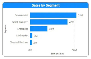
4. Clustered Bar Chart
A clustered bar chart is used to create a sale by segment report, X – axis of the chart will be “Sales” and Y-Axis of the chart will be the “Segment”,
For this add a clustered bar chart, the right-click on the chart, drag the “Sales” column of the financial table to the X-axis of the charts, similarly drag the “Segment” column of the financial table to the Y-axis of the charts.
In Visualization Tab, click on the format your visuals > General, then change the Title of the Clustered Column Chart visuals as shown in the figure.
you can see the clustered bar chart is allocated as the second chart in the dashboard report.
5. Donut Chart
A Donut chart is used to create a sale by country report, “Legend” of the chart will be “Country” and “Values” of the chart will be the “Sales”,
For this add a Donut chart, the right-click on the chart, drag the “Country” column of the financial table to the “Legend” of the charts, similarly drag the “Sales” column of the financial table to the “Values” of the charts.
In Visualization Tab, click on the format your visuals > General, then change the Title of the Clustered Column Chart visuals as shown in the figure.
you can see the donut chart is allocated as the third chart in the dashboard report.
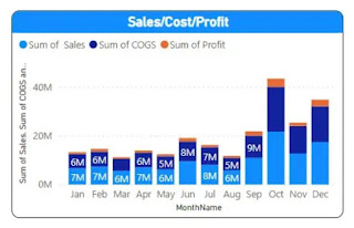
6. Stacked Column Chart
A stacked column chart is used to create a sale, cost, and profit report by month report in a single visual, X – axis of the chart will be “MonthName”, and Y-Axis of the chart will be the “Sum of Sales”, “Sum of COGS” and “Sum of Profit”,
For this add a clustered column chart, the right-click on the chart, drag the “MonthName” column of the date table to the X-axis of the charts, similarly drag the “Sales”, “COGS” and “Profit” columns of the financial table to the Y-axis of the charts.
In Visualization Tab, click on the format your visuals > General, then change the Title of the Clustered Column Chart visuals as shown in the figure.
you can see the stacked column chart is allocated as the second chart in the dashboard report.
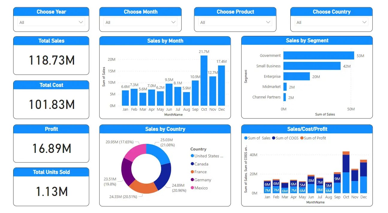
Finally you can see the output of our sales dashboard project as shown below,
As discussed above here we have four slicers for filtering the charts with different search criterias, you can choose four slicers values according to your requirement , when we choose the slicer values , you can see the values in the charts and cards will be chaging according the value we filtered in the slicers.
for example , in the month slicer, choose january only , the n the charts will be only shown the data for january only.
Conclusion
Now our project is over, this project is an easy project, because our sample financial dataset is already clean, also we have only two data models here, for more complex projects we may have more data models and need to clean the all the tables also need to make different relation ship to various models. So as a fresher you can start power bi learning by using this simple Microsoft sample data set.



Power BI Sales KPI Dashboard Project – Using Microsoft Sample Data Set